
Feature walls...


 Via Sunset
 Image Source
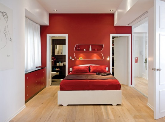
Romantic Red...

 Via Sunset
 Image Source
 Image Source
 Via Decorology
The Red Chandelier...
 Image Source
 Via HGTV
Red Accents...
 Image Source


Image Source
 Image Source
 Image Source


 Via Susan on Design
...from bold to the barely there
 Image Source
The Red Door...
 Via HGTV
 ...and a stunning outdoor feature wall
 Via Sunset
...and a cheery& elegant alfresco decor
 Image Source
Red is a bright, warm color that evokes strong emotions. Red is associated with love, warmth, and comfort. Red is also considered an intense, or even angry, color that creates feelings of excitement or intensity. For the Chinese, Red is also the color of happiness, luck and prosperity. For more on color, see my post on the ABCD of color.
It is ever so appropriate on this double occasion for celebration, Valentine's day falls on the Chinese New Year! I had so much fun putting this post together, and I hope that if you're already an avid fan of red, you've been inspired, that if you usually shy away from this bold color, you're tempted to give it a go in your future decor projects. Kung Shee fat Choy, Bonheur et Prosperite, Happiness and Success,
Sharon.
...And I had so much fun viewing this post! Red and I go waaaay back!
ReplyDeleteWOW Inspiring for Sure! Happy Valentines Day!
ReplyDeleteThere is always a great deal of white associated to red in houses. Any ideas about other colour associations that work with red?
ReplyDelete@ Rabin: I think it depends on the hue and tone of the red in question and what kind of atmosphere you want in your interior.
ReplyDeleteA very masculine color scheme is red mixed with neutrals. Think fire-engine red, grey and black. or brick red, white and earthy colors
For a glam interior: red+ metallics, silver or gold...use sparingly, it can be overwhelming
If a coral red(more like orangey red), turquoise is great. Navy blue too.
Also, you should know that the complementary color of red is green. They contrast very well.
You can go monochrome and choose various shades of red that match. But I advise it only for the kitchen/dining areas.
Above all, go ahead and get creative! If you pay attention to patterns/textures, you'll find that red matches with almost everything;)
Hope this helps...